
Also I'd remove the underlining from the links on the main site - they just make the design look 'busy'. If they are not noticeable I'd change the colour a bit but I think it would be fine. You could keep the underlining for the mouse overs..


Guest viewing limit reached
- You have reached the maximum number of guest views allowed
- Please register below to remove this limitation
- Already a member? Click here to login
-
Welcome to the DeeperBlue.com Forums, the largest online community dedicated to Freediving, Scuba Diving and Spearfishing. To gain full access to the DeeperBlue.com Forums you must register for a free account. As a registered member you will be able to:
- Join over 47,943+ fellow diving enthusiasts from around the world on this forum
- Participate in and browse from over 531,990+ posts.
- Communicate privately with other divers from around the world.
- Post your own photos or view from 7,455+ user submitted images.
- All this and much more...
You can gain access to all this absolutely free when you register for an account, so sign up today!
You are using an out of date browser. It may not display this or other websites correctly.
You should upgrade or use an alternative browser.
You should upgrade or use an alternative browser.
A New Design for www.DeeperBlue.com - what do you think?
- Thread starter Stephan Whelan
- Start date
Thread Status: Hello
, There was no answer in this thread for more than 90 days.
It can take a long time to get an up-to-date response or contact with relevant users.
It can take a long time to get an up-to-date response or contact with relevant users.

Sorry Kars but changing a logo unfortunately involves more work than just applying some filters. Basically you will need a logo available in a vector format so that you can scale it to arbitrary sizes without loss of quality. Then you can use it on websites, t-shirts, posters or whatever and it will always look the same. Also you want to have colour / b-w / greyscale versions should they be necessary.
I also think that the font is rather dated, so a fresh one would do no harm.
I also think that the font is rather dated, so a fresh one would do no harm.
Sorry Kars but changing a logo unfortunately involves more work than just applying some filters. Basically you will need a logo available in a vector format so that you can scale it to arbitrary sizes without loss of quality. Then you can use it on websites, t-shirts, posters or whatever and it will always look the same. Also you want to have colour / b-w / greyscale versions should they be necessary.
I also think that the font is rather dated, so a fresh one would do no harm.
I KNOW that vector stuff Arno, I said it was just a little quick effort. Surely the logo can use a new-er font.
Just as a new logo idea, perhaps line up the p and b (I cannot get it to align in this text format):
Deeper...
. . . ...blue

Hello...
First time poster but I visit this site all the time and am a huge fan.
I'm a graphic designer and if you would give me the opotunity to design a new logo for the site, I would love to do so free of charge
First time poster but I visit this site all the time and am a huge fan.
I'm a graphic designer and if you would give me the opotunity to design a new logo for the site, I would love to do so free of charge


So folks - i'm keen to get some of the talent here on DB to help design the next iteration of the logo (as discussed above). Who would like to be involved/volunteer some designs? I'm likely to offer a small reward to the eventual winner...
Ok, stephan,
I took a moment to touch up your current logo a bit.
I've removed the shadows, and lighten up and slightly shifted the colours a bit toward green.
Adjusted:

Current:

Maybe you can add a tiny bit of depth to the layout with a very supple shadow line below each blue bar. - I do not like the flat windows 8 tiles look.
Looks nice, maybe flatten the bubles a bit more, remove the light reflection?
My idea is to keep the feel of the original logo but make it more modern.
The logo can't focus on just one of the diving methods.
So here is my design.
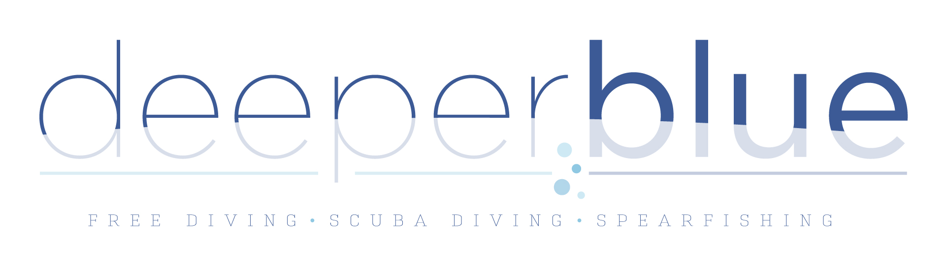
The logo can't focus on just one of the diving methods.
So here is my design.
Nice stuff drdb. Just one thing, did you try "invert" the colours, ie. dark at the bottom & light at the top? Because that's more like water where the deeper you go the darker it gets (as in the current logo).
Wow. Maybe it was just because it was late at night but I didn't try that. I trialled about 20 variations but didn't think to flip the colours.
Makes sense too. I wanted to create something that has meaning to it. So the more input the better.
I will upload an amended version tomorrow.
Makes sense too. I wanted to create something that has meaning to it. So the more input the better.
I will upload an amended version tomorrow.
I really like the basic approach and it is definitely better with the 2nd and 3rd version. Some opinions:
The contrast is too low imho.
In version 3 the second e has a bit of dark blue in the right middle corner.
I'd write freediving together.
I'm not quite sure about the colour scheme. The underline of deeper doesn't quite fit with it's greenish tint. Not quite sure whether it even needs the greenish colour at all.
I'm not a pro illustrator so feel free to ignore me
The contrast is too low imho.
In version 3 the second e has a bit of dark blue in the right middle corner.
I'd write freediving together.
I'm not quite sure about the colour scheme. The underline of deeper doesn't quite fit with it's greenish tint. Not quite sure whether it even needs the greenish colour at all.
I'm not a pro illustrator so feel free to ignore me
These are just quick changes so there will be a few flaws. The plan would be to pull the exact colours from the site. Both light and darker blues.
Not sure about the green tint to the blue you're seeing. Maybe different colour calabrations.
If it is a style people like I am happy to push the design as far as it will go.
I would like to put back into a community that has given me so much knowlegde. I dont have the sort of freediving knowledge some of these seasoned divers have so I'd love to add in a way I can
Not sure about the green tint to the blue you're seeing. Maybe different colour calabrations.
If it is a style people like I am happy to push the design as far as it will go.
I would like to put back into a community that has given me so much knowlegde. I dont have the sort of freediving knowledge some of these seasoned divers have so I'd love to add in a way I can
OK guys - thanks for the logo work so far. My comments are:
- Personally I don't like the font - i'd like the new logo to be an iteration on the previous one and the font is too different
- Size wise the logo is too big and won't scale. Look at how big the current logo is and you can see the suggestions so far won't look good at that size - e.g. the text below the logo is too small to scale properly.
So we can move away from the bauhaus stylised font?
I personally think the font should compliment the new clean and fresh look of the website. (but thats a personal opinion)
Also there is a very large space next to where the logo sits in the header. I think that using a logo that utilises this space a bit better would create in a better brand recognition of deeper blue.
I personally think the font should compliment the new clean and fresh look of the website. (but thats a personal opinion)
Also there is a very large space next to where the logo sits in the header. I think that using a logo that utilises this space a bit better would create in a better brand recognition of deeper blue.