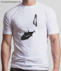
I too like number 3 best. Unusual & clever design. I particularly like the way the diver is drawn. I would be tempted to make the diver a little more prominent (maybe larger and closer to the middle?) and the fish perhaps a little less prominent (e.g. a tad smaller?). But maybe that wouldn't work as well overall?I'll have number 3 with a bass on it.
I also like the "giant's cocktail" image a lot - that's very much how I feel/see myself in the water while spearing - and the sunshine often does stream through like that. I guess the border is a little confusing but it is quite attractive. I like the water surface detail.
Not so keen on the multi-coloured one - you have to get quite close to appreciate it (& read it) and discover that is about spearfishing. The setting sun motif might appeal to the Japanese forum members - as it could equally be a rising sun I suppose
") - in which case maybe you could use some Japanese text, e.g. 日本 やり釣
- in which case maybe you could use some Japanese text, e.g. 日本 やり釣